PenTester.ca
Introduction
What if the $50,000 security audit you just paid for didn’t actually make you any safer? A lot of the industry runs on automated scanners and security theatre: tools that churn out long reports and miss the way real attackers get in. The serious flaws tend to live in custom business logic, and finding them takes a human who knows where to look. PenTester.ca is that human. Kaeden tests systems by hand, and the brand and website needed to say so: cut through the noise, find what’s hidden, show the work. The finished site carries full motion design in 855 kB on first load, about a third of a typical mobile homepage.
The Brief
Design and engineer a brand identity and high-performance website for PenTester.ca, positioning her elite, manual penetration testing in stark contrast to automated scanners and big-firm security theatre.
My Role
Solo designer and front-end developer: brand identity, UX and UI, motion design and the coded build.
Field of Practice
Visual identity, web design, UI and motion design, and front-end development.
Medium
Brand guidelines, business cards, and a responsive website built in HTML, CSS and GSAP.
Live at pentester.caBranding
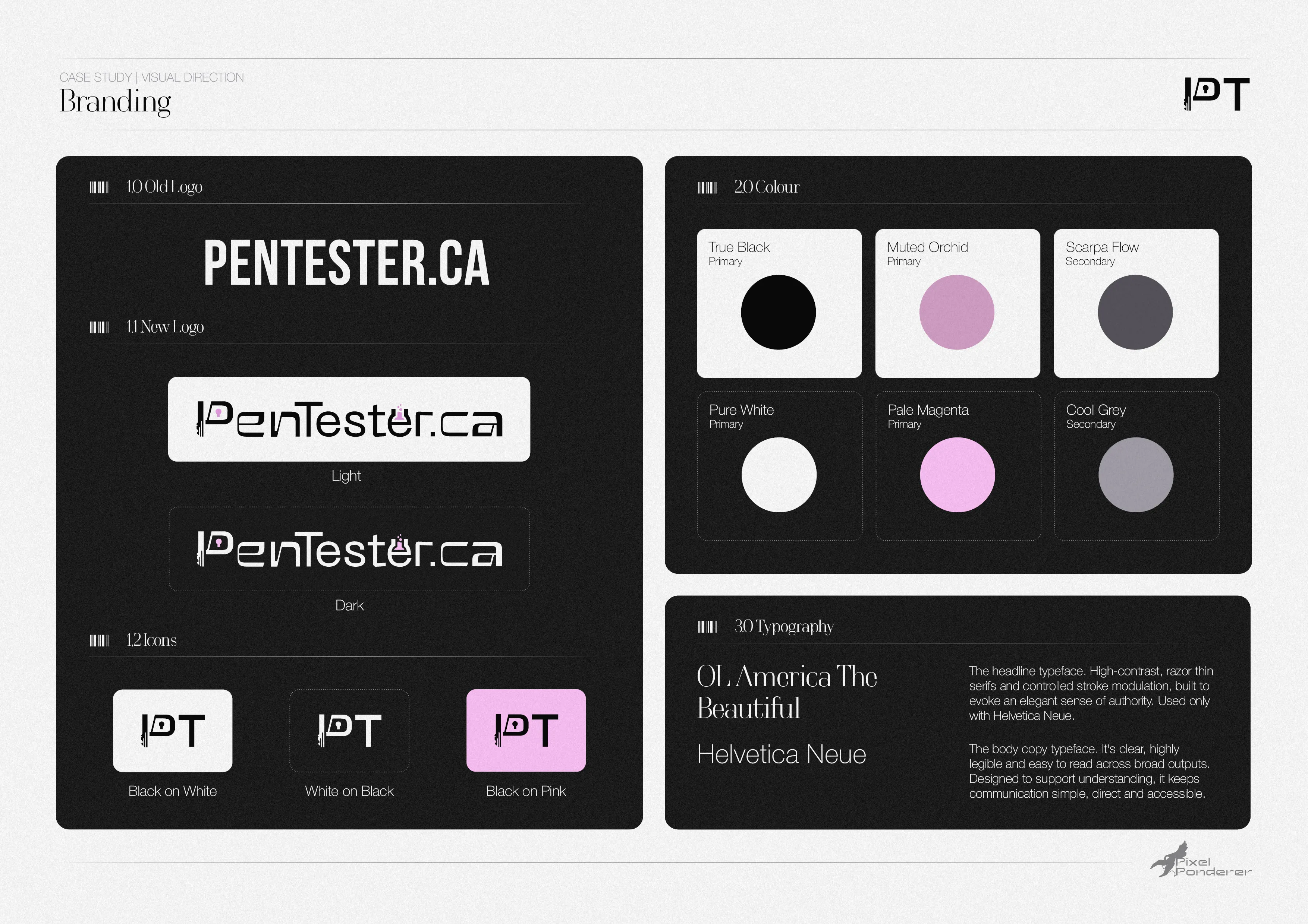
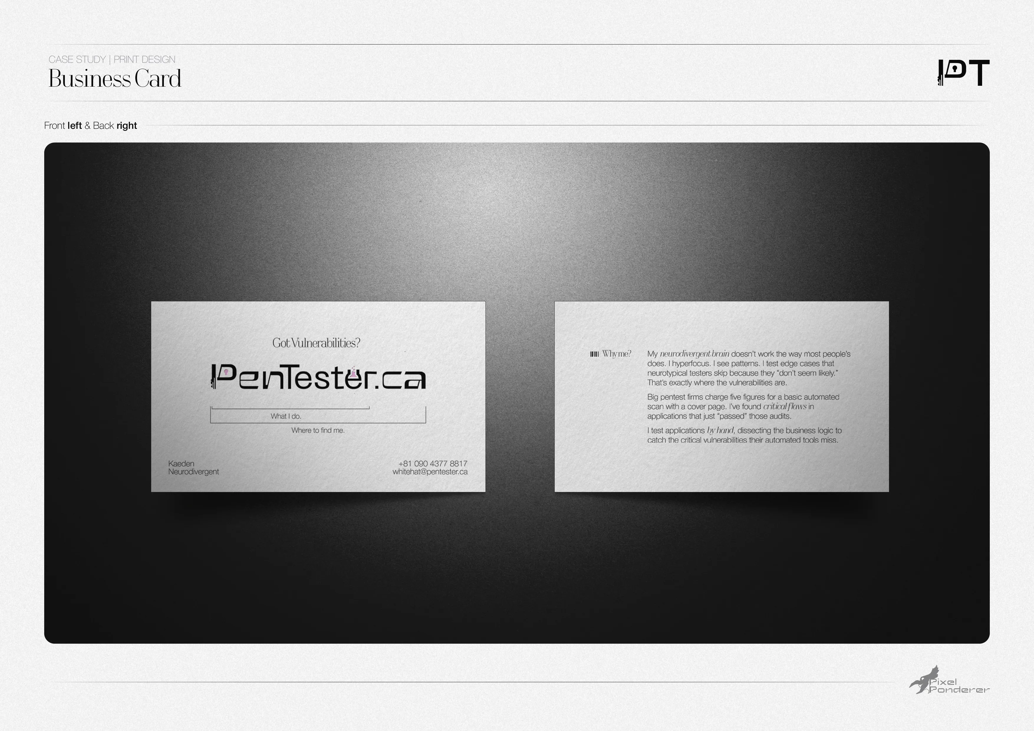
If you make a living telling Fortune 500 companies their security is broken, you can’t turn up looking like a vendor selling glowing green padlocks. Cybersecurity branding is full of those clichés, and most of it looks like it was made by the software it’s selling. PenTester.ca needed to look like a sharp human mind instead. The identity anchors on one idea: noise versus clarity. A static grain texture stands in for the endless output of automated scanners. A soft pink orb is the focused attention that finds what they miss. The logotype, palette and type system carry that tension from the guidelines through to the business cards.
Web Design
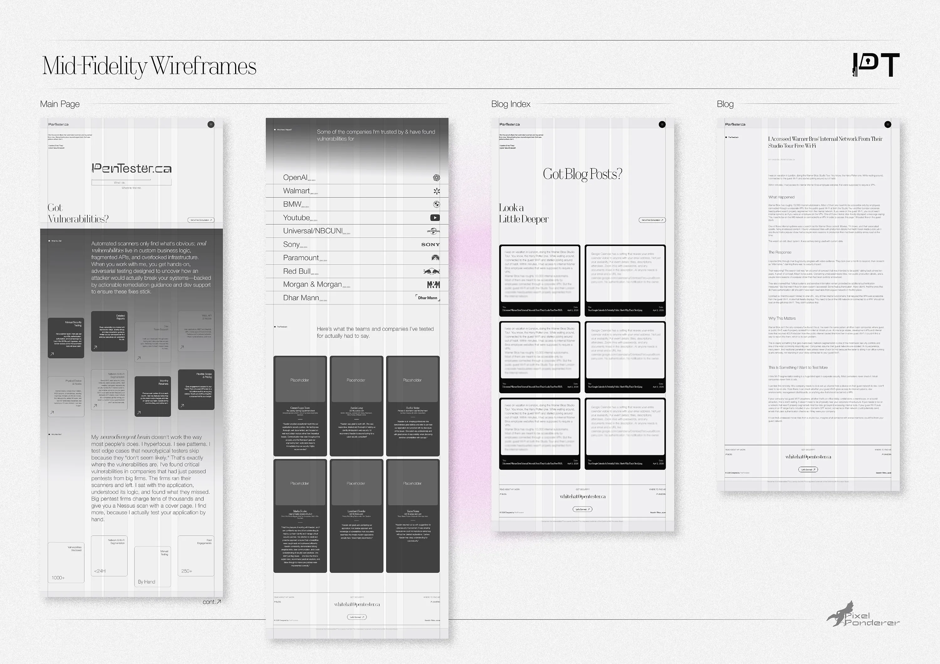
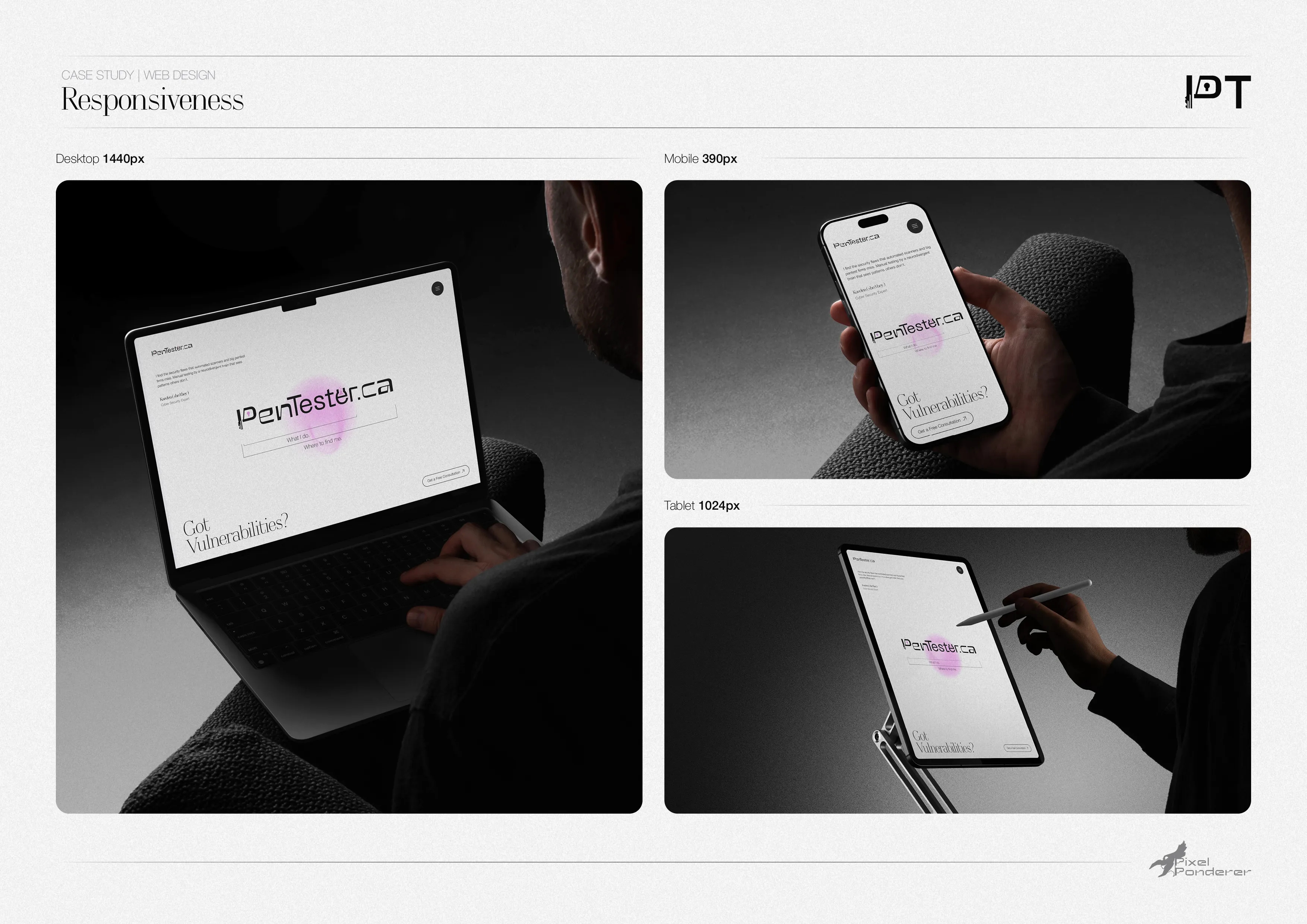
The site takes the same idea and makes it something you can use. The mid-fidelity wireframes came first, working out structure, hierarchy and content at desktop before any visuals went near it. From there, the layout was built to flex, holding together from a 1440 px desktop through tablet to a 390 px phone without losing any of the motion. Then the interaction does the talking. The noise canvas sits on every page and clears the moment someone reaches for a primary action. Scroll-triggered text reveals uncover the content piece by piece, the same way a good test uncovers a system.
Build & Performance
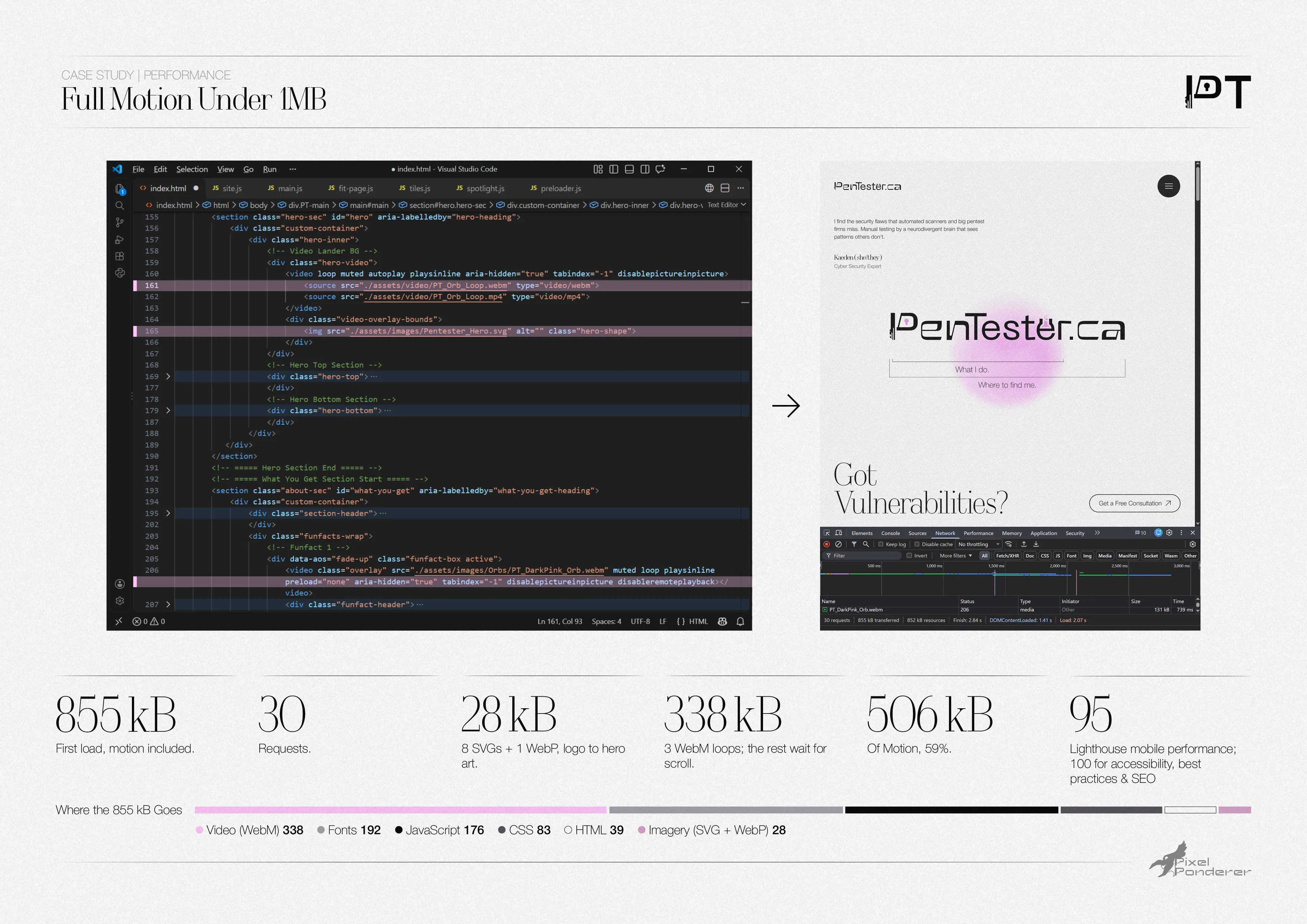
Motion usually comes with a bill, and the early build ran one up: more than 20 MB for a single page. Two of the looping orb GIFs accounted for 14.7 MB on their own. Rebuilt as WebM, the three loops that play on first load weigh 338 kB together, and the rest wait until they’re scrolled to. Photos went from JPG to WebP and graphics became SVG, so all the imagery from the logo to the hero art comes to 28 kB: eight SVGs and one WebP. A 2.7 MB icon library loaded for a handful of icons was cut.
The result is 855 kB on first load across 30 requests, motion included. Motion is 506 kB of that, 59%: the weight goes on what people see, not on overhead. That’s a third of the median mobile homepage (2.56 MB, HTTP Archive 2025), measured before any server compression. Tested the hard way, on an emulated mid-range phone over slow 4G, Lighthouse scores it 95 for performance and 100 for accessibility, best practices and SEO: the main content is on screen in 1.9 s, scripts hold up the page for just 60 ms in total, and the layout never shifts. When your whole pitch is attention to detail, the website had better prove it.
Full Lighthouse report (PDF)